7 Tips to Improve Your Mobile UX Design
Mobile applications are riding high now as they offer a reliable way to deliver content and services. But in this crowded marketplace, how can a mobile app stay useful, relevant and valuable to delight and retain users?
Here are 7 UX design tips that we believe are key to creating a great mobile user experience.
1. One screen – one task
Reduce the number of actions the user needs to make to get what they want from your app.
Create each screen for only one thing, maybe with just a single call to action (CTA). It’s easier to understand, use, and create. Take Uber, for example. Uber knows that the user’s goal is to find a taxi. And it does not overload them with information – you just need to choose a location and you have it all on one screen.

2. Invisible user interface (UI)
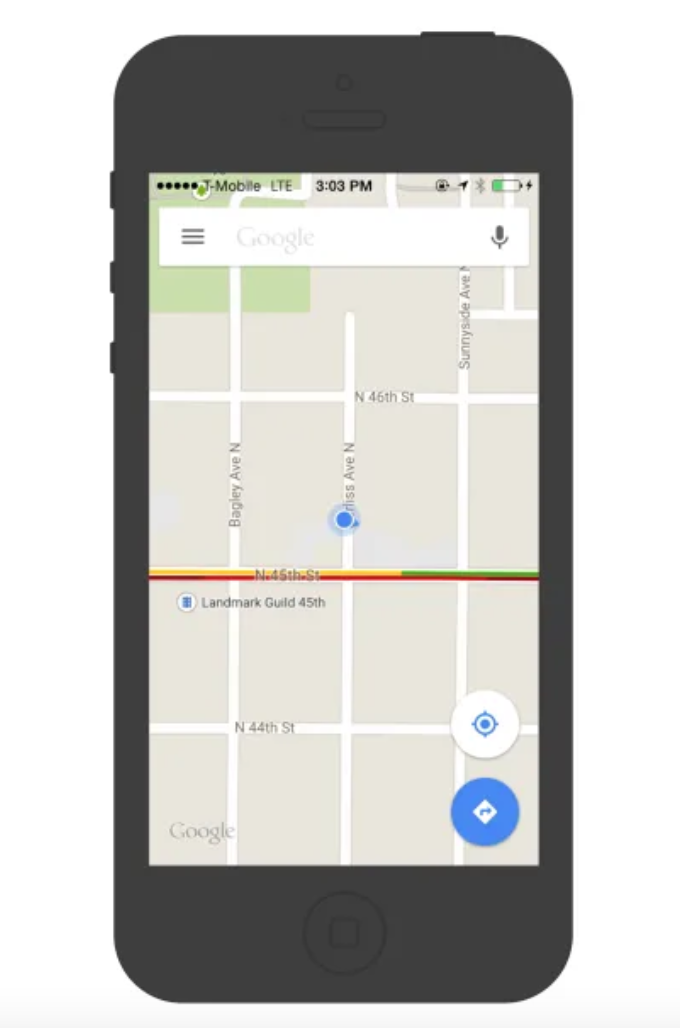
Focus on content and remove any secondary elements that are unnecessary for the user’s task. The content becomes the interface. A good example is Google Maps. During the redesign, Google removed all panels and buttons and made the map the interface.
3. Use “negative” space to draw user attention to what’s important
A “negative” space (i.e., white space between and around design elements or a page) is often neglected. While many designers may consider this a waste of valuable screen real estate, negative space is an important element of mobile design.
“White space should be seen as an active element and not as a passive background,” – Jan Tschichold.
White space is not only responsible for the readability and prioritization of content; it also plays an important role in visual markup, which helps simplify UI and improve UX.
4. Simplify navigation
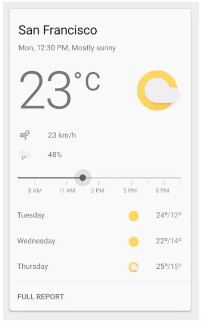
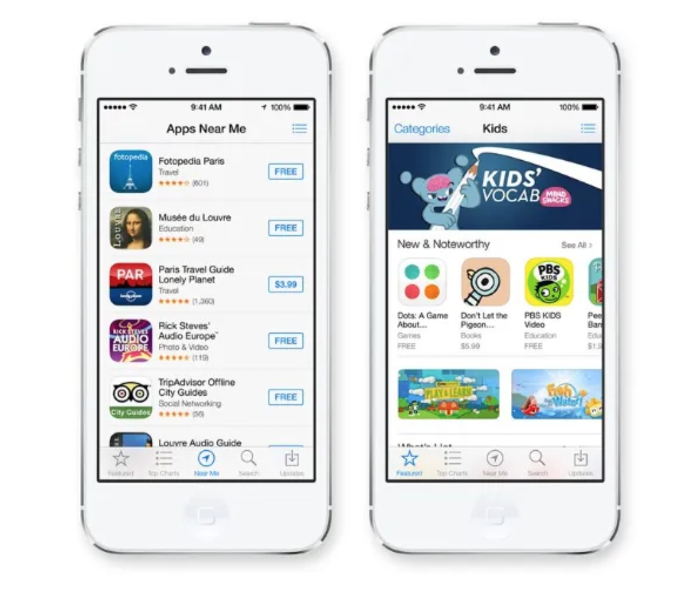
Mobile navigation should be clear, accessible and take up little space. Therefore, bookmarks and menus are suitable here. They show all the main features and with one tap, the user can instantly go from one page to another.
5. Optimize your mobile design for large screens
That’s how users typically hold their smartphone, according to numerous research findings:
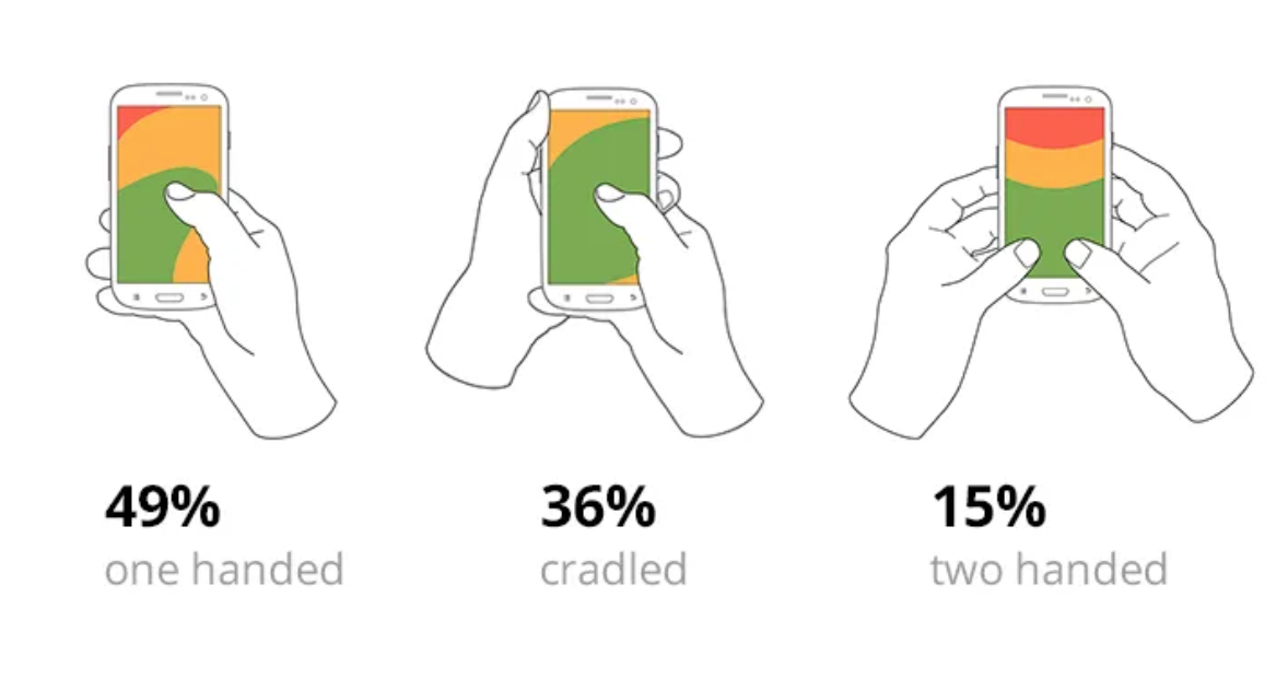
85% of users use just one hand. Here is a heatmap of the space available to a finger:
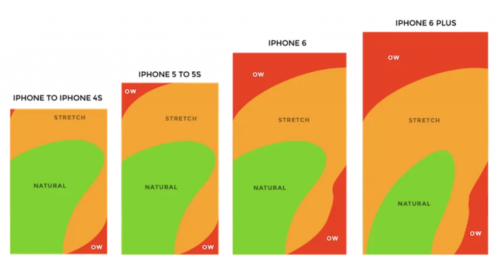
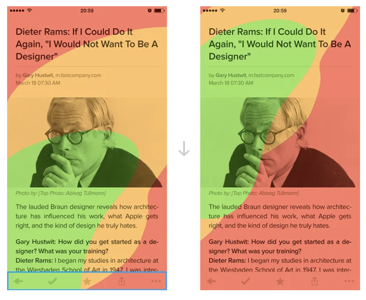
It is important to optimize the design to improve the user experience. Make sure your application can be operated with just one finger, and place navigation items in an accessible place:
6. Don’t keep user waiting
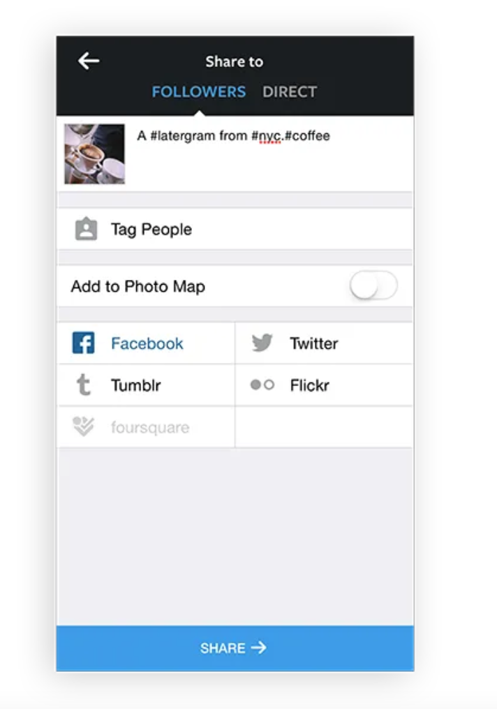
Try to make your application lightweight, fast, and responsive. Run tasks in the background to make them appear instant to the user. Instagram is a good example – each time user uploads a new image, it prompts them to enter tags. While the user is doing this, the picture will already be uploaded.
7. Use push notifications wisely
Think twice before sending a message. Every day the user is bombarded with hundreds of notifications. This is the # 1 reason why users uninstall apps:
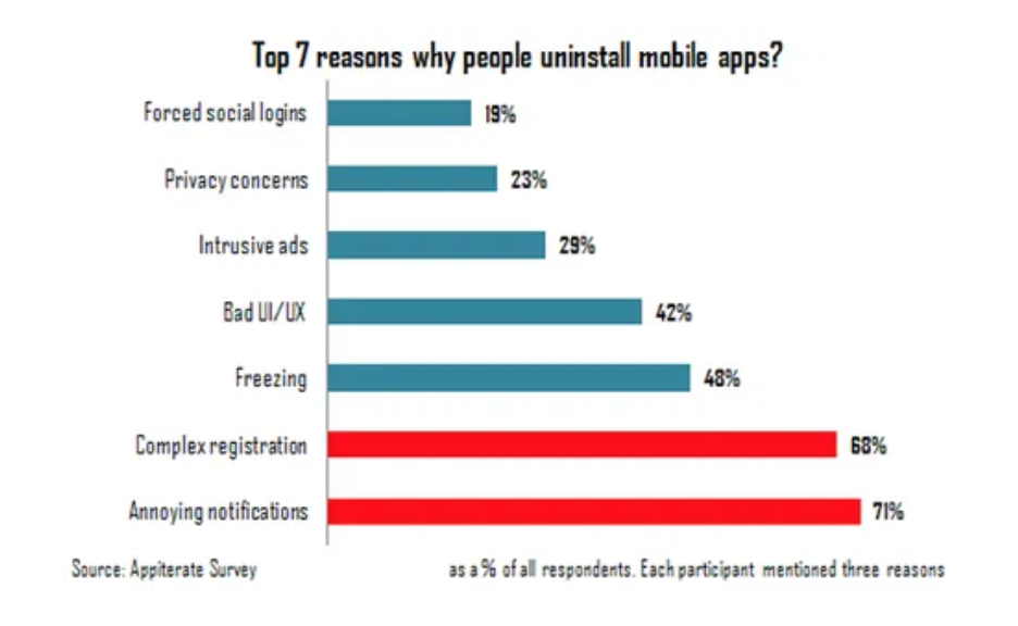
Only send notifications if they are truly needed.
Final Thoughts
The most important things to keep in mind when designing a mobile app are usefulness and intuitiveness. If the application is useless, then no one will use it. If it is useful but requires a lot of time and effort from the user, then people will not use it either. Good UI and UX solve both of these problems.
Stay tuned with Software Focus!

